
How to use Python for Algorithmic Trading on the Stock Exchange Part 2
We continue publishing the adaptation of the DataCamp manual on using Python to develop financial applications.
- The first part of the story told about the structure of financial markets, stocks and trading strategies, data of time series, as well as what will be needed to start the development.

The structure of the manual:
- The first part is intended for beginners in the market, it will deal with the design of financial markets, stocks and trading strategies, time series data, and what will be needed to start the development.
- The second part introduces an introduction to working with time series data and financial analysis tools, such as calculating volatility and moving averages, using the Pandas Python library.
- Then we proceed to the immediate development of a simple impulse trading strategy.
- In the fourth part, we will talk about how to conduct backtest strategies on historical data.
- In the end, the questions of strategy optimization will be touched upon to increase its productivity, as well as to evaluate its performance and reliability.
Now that you know more about data requirements, understand the concept of time series, and become acquainted with pandas, it’s time to go deeper into the topic of financial analysis that is necessary to create a trading strategy.
Repository of this manual can be downloaded here.
General Financial Analysis: Profit Calculation
- With a simple calculation of the daily percent change, for example, dividends and other factors are not taken into account simply a percentage change in the price of the acquired shares is noted compared to the previous trading day. You can easily calculate such changes using the:
pct_change ()
function included in the Pandas package.
# Import `numpy` as `np`
import numpy as np

# Assign `Adj Close` to `daily_close`
daily_close = aapl[['Adj Close']]

# Daily returns
daily_pct_change = daily_close.pct_change()

# Replace NA values with 0
daily_pct_change.fillna(0, inplace=True)

# Inspect daily returns
print(daily_pct_change)

# Daily log returns
daily_log_returns = np.log(daily_close.pct_change()+1)

# Print daily log returns
print(daily_log_returns)
The income will be calculated on a logarithmic scale – this allows you to visually track changes in time.
- Knowing the profit for the day is good, but what if we need to calculate this figure for a month or even a quarter? In such cases, you can use:
resample ()
function, which we covered in the previous part of the manual:
# Resample `aapl` to business months, take last observation as value
monthly = aapl.resample('BM').apply(lambda x: x[-1])

# Calculate the monthly percentage change
monthly.pct_change()

# Resample `aapl` to quarters, take the mean as value per quarter
quarter = aapl.resample("4M").mean()

# Calculate the quarterly percentage change
quarter.pct_change()
- Using pct_change () is convenient, but in that case, it is difficult to understand exactly how the daily income is calculated. Therefore, as an alternative, you can use the Pandas function called shift (). Then you need to separate the daily_close values by daily_close.shift (1) -1. If this function is used, NA-values will be located at the beginning of the resulting data frame.
For reference, the calculation of the daily change in the value of shares is calculated by the formula:
Where:
- P – is the price;
- T – is the time (in our case, the day);
- R – is the revenue.
You can create a daily_pct_change distribution schedule:
# Import matplotlib
import matplotlib.pyplot as plt

# Plot the distribution of `daily_pct_c`
daily_pct_change.hist(bins=50)

# Show the plot
plt.show()

# Pull up summary statistics
print(daily_pct_change.describe())
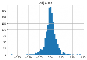
- The result looks symmetrical and normally distributed: the daily price change is in the area of bin 0.00. It should be understood that in order to correctly interpret the results of the histogram, you need to use the describe () function applied to daily_pct_c. In this case, it will be seen that the mean is also close to bin 0.00, and the standard deviation is 0.02. You also need to study percentiles to understand how much data is out of bounds -0.0101672, 0.001677 and 0.014306.
- The indicator of the total daily rate of return is useful for determining the cost of investments in regular segments. To calculate the total daily rate of profit, you can use the values of daily changes in the price of assets in percent, adding to them 1 and calculate the final values:
# Calculate the cumulative daily returns
cum_daily_return = (1 + daily_pct_change).cumprod()

# Print `cum_daily_return`
print(cum_daily_return)
- Here again, you can use Matplotlib to quickly draw cum_daily_return. You just need to add the plot () function and, optionally, determine the size of the graph using fig size.
# Import matplotlib
import matplotlib.pyplot as plt

# Plot the cumulative daily returns
cum_daily_return.plot(figsize=(12,8))

# Show the plot
plt.show()
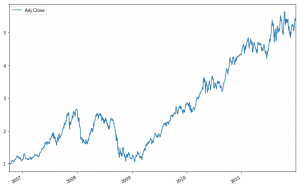
- It’s pretty simple. Now, if you need to analyze not the daily income, but monthly, you should return to the function resample () – with its help you can cum_daily_return to monthly values:
# Resample the cumulative daily return to cumulative monthly return
cum_monthly_return = cum_daily_return.resample("M").mean()

# Print the `cum_monthly_return`
print(cum_monthly_return)
- Knowing how to calculate income is a useful skill, but in practice, these values rarely carry valuable information unless you compare them with the performance of other stocks. That’s why in two different instances two or more shares are often compared.
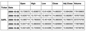
- To do this too, you first need to download more data – in our case, c Yahoo! Finance. To do this, you can create a function that will use ticker shares, as well as the start and end dates of the trading period. In the example below, the data () function takes a ticker to retrieve data, starting from start date to end date and returns the result of the get () function. Data is marked with correct tickets, resulting in a data frame containing this information.
In the code below, the shares of Apple, Microsoft, IBM, and Google are loaded into one common data frame:
def get(tickers, startdate, enddate):
  def data(ticker):
    return (pdr.get_data_yahoo(ticker, start=startdate, end=enddate))
  datas = map (data, tickers)
  return(pd.concat(datas, keys=tickers, names=['Ticker', 'Date']))

tickers = ['AAPL', 'MSFT', 'IBM', 'GOOG']
all_data = get(tickers, datetime.datetime(2006, 10, 1), datetime.datetime(2012, 1, 1))
Note: this code was also used in the Pandas manual for finance, and it was later finalized. Also, because there are currently problems downloading data from Yahoo! Finance, for correct work, you may have to download the fix_yahoo_finance package – installation instructions can be found here or in the Repository of this manual.
Here is the result of executing this code:
This large data frame can be used to draw interesting graphs:
# Import matplotlib
import matplotlib.pyplot as plt
# Isolate the `Adj Close` values and transform the DataFrame
daily_close_px = all_data[['Adj Close']].reset_index().pivot('Date', 'Ticker', 'Adj Close')
# Calculate the daily percentage change for `daily_close_px`
daily_pct_change = daily_close_px.pct_change()
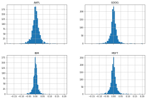
# Plot the distributions
daily_pct_change.hist(bins=50, sharex=True, figsize=(12,8))
# Show the resulting plot
plt.show()
- Another useful graph for financial analysis is the scattering matrix. You can get it using the panda’s library. It will be necessary to add the function scatter_matrix () to the code. The arguments are passed daily_pct_change, and the diagonal is set to a value of choice – so as to obtain a kernel density estimation graph (Kernel Density Estimate, KDE). Also, with the alpha argument, you can set transparency, and use fig size to resize the graph.
# Import matplotlib
import matplotlib.pyplot as plt

# Plot a scatter matrix with the `daily_pct_change` data
pd.scatter_matrix(daily_pct_change, diagonal='kde', alpha=0.1,figsize=(12,12))

# Show the plot
plt.show()
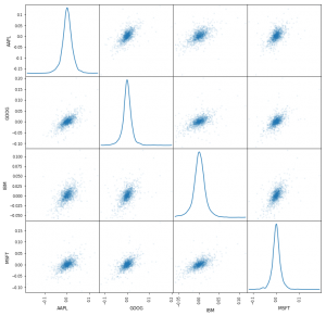
- In the case of local work, the plotting module (ie pd.plotting.scatter_matrix ()) may be needed to construct the scattering matrix.
In the next part of the guide, we’ll talk about using sliding windows for financial analysis, calculating volatility, and applying the usual least-squares regression.
To be continued..

